MCDC News and Updates

New data application shows population by age and demographics

A new MCDC data application, Population Estimates by Age and Demographics, provides population data at the state and county level for multiple age cohorts, data years, and demographic groups. These data are based on US Census populations with special “bridged race” categories created by the Census Bureau for the National Center for Health Statistics (NCHS).

The new application allows users to select one or more states (including counties, for single-state selections), data years (1990–2015), demographic groups, and age cohorts. There are two predefined age cohort sets, and users may also define up to 20 custom age cohorts, including both single year of age and multi-year age ranges. Age ranges may overlap.

This application complements our other population estimates apps, in particular the Population Trends app, which uses the same NCHS source data to compare population estimates between two data years. However, the Population Trends application is simpler, using only predefined age cohorts and a more limited set of data years and demographic groups. This new application offers more options and an Excel data export feature.

We hope you find this a useful tool. Please contact us with any problems, bugs, or suggestions.

Map of the Month

Missouri’s Registered Voters — Where Are They?

For the upcoming November 8 Election Day, this month we present a view of registered voters in Missouri.

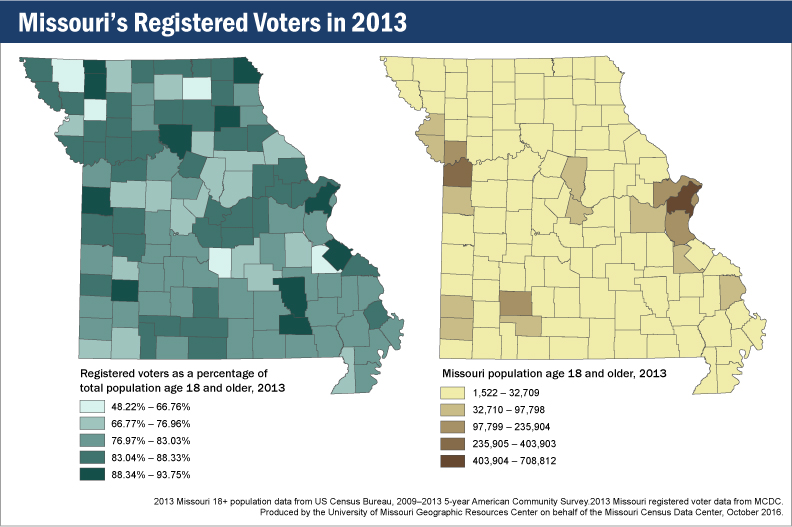
Missouri registered voters in 2013

Looking at the map (left) of registered voters in 2013 as a percentage of total county population ages 18 and older, we see some interesting patterns. The areas around Kansas City and St. Louis represent two large blocks of registered voters, but that shouldn’t surprise anyone, because those places represent the two largest concentrations of people in the state. (The map on the right shows where Missourians aged 18 and older live.)

What about the rest of the state, though? Dade County stands out with a fairly high percentage of registered voters, but neither Boone nor Cole counties are in the top tier of voter registration. Then there are counties with lower total populations but higher registration rates: Carter, Chariton, Clark, Gentry, Reynolds, Shelby, Ste. Genevieve, and Worth are all in the highest tier of voter registration, despite not being highly populated.

What’s the point? In addition to the usual message of “every vote counts,” these two maps show that large populations do not necessarily translate to large voter populations. This will make for some interesting viewing once the returns start coming in on Election Day. Keep in mind, too, that this map of voter registration rates can be compared to a map of voter turnout to see whether these patterns remain the same. That’s a comparison for another month.

Map of the Month

What Does Half of Missouri Look Like?

According to the U.S. Census, Missouri had a population of 5,988,927 people in 2010. Where do they all live, though? What is the fewest number of counties required to represent half of the population? Or the fewest number of census blocks? Or, with 2016 being an election year, the fewest number of voter tabulation districts?

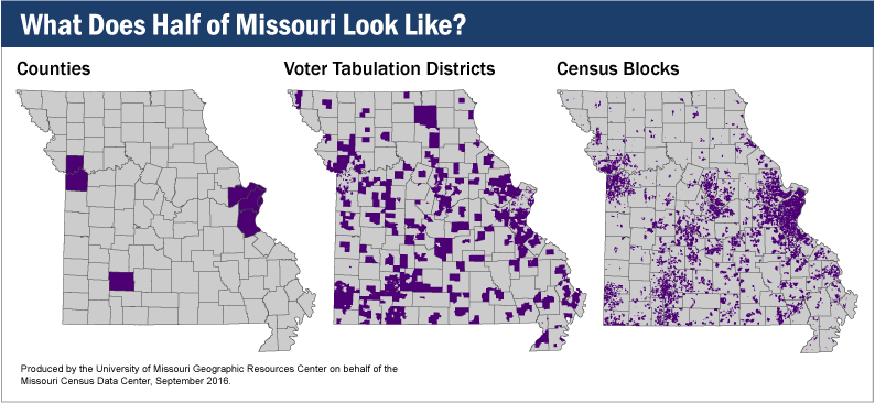
What does half of Missouri look like?

In each case, it turns out that you don’t need that many. If you were collecting counties, you would need only seven — Clay, Greene, Jackson, Jefferson, St. Charles, St. Louis, and St. Louis City. That’s just 6% of Missouri’s total of 115 counties.

Voter tabulation districts tell a similar story. To get to half of Missouri’s population, you would need only 941 of the 4,813 districts in the state, or roughly 19%.

Most starkly of all, out of Missouri’s 343,565 census blocks, you would need only 5.3%, or 18,455, to represent half the state’s population.