MCDC News and Updates

Missouri County Pages Are Back

After a very long hiatus, the application formerly known as “Missouri County Pages” is back in operation. We’re now calling it “Missouri [County] Fact Sheets”, and a few of the old data variables have been replaced. Otherwise, the application has similar appearance and functionality to the old version.

The Missouri Fact Sheets application generates a report for any county in Missouri, including population trends, age and race, income, employment, agriculture, households and housing, poverty, education, and children and families.

See it in action here: http://mcdc.missouri.edu/applications/MO-county-factsheets/.

Map of the Month

Missouri Educational Attainment and Income

Educational attainment is an established, validated predictor of income. This map-of-the-month series looks at the distribution of both characteristics in Missouri’s counties. Derived from the U.S. Census Bureau, American Community Survey (ACS) 2012-2016 5-year data, Missouri households are mapped here by level of educational attainment and median household income, while a bivariate choropleth map displays the variable impact of earning less than a high school diploma on household income.

Education vs. Income in Missouri, 2012-2016

The bar chart, based on the 2016 ACS 1-year release, establishes the relative distribution of median household income by level of education. While the overall median household in Missouri realizes approximately $36,000 in income, the median household in Missouri headed by someone without a high school diploma or GED is closer to $20,000.  Completing high school results in a bump of roughly  $10,000, with the median household income of high school graduates a little more than $30,000. Completing some college or an associate’s (2-year degree) results in an incremental increase in household median income to the mid-$30,000 range, but it is completion of a bachelor’s degree or greater that accelerates median household income into the mid-$40,000 to mid-$50,000 range annually.

Educational attainment, however, is not the only driver of income. Access to workforce opportunities and proximity to infrastructure impacts potential income too. Review of the Median household income map reveals the influence of infrastructure investment and population density in driving up wages and income, as seen in the counties shaded in the darkest green.  It’s also interesting to visually note the geographically layered gradation of quantiles of the state with the I-70 highway corridor connecting Missouri’s relatively high income metropolitan areas, and the agricultural northern tier of counties falling into the mid-quantiles, while lower income households concentrate in the southern tier of counties (with exception of income concentrating in the Springfield metro area).

Not surprisingly, a close look at the concentrations of level of educational attainment (the blue-scale maps), correlate at the county level to the median household income map fairly predictably: Populations with higher concentrations of higher levels of education also have higher median household incomes.

The bivariate choropleth map, Median household income by percent of adults with less than high school diploma or GED, lets us see the outliers as well as validating the correlations we anticipated. For example, the truer the shade of blue a county is coded, the higher the percent of the adult population without a high school diploma/GED and the higher median household income indicating some combination of higher wage job and income opportunities relative to educational qualifications. We see these on the periphery of the other end of the spectrum, counties with higher median household incomes and the lowest rates of households with low educational attainment, suggesting “bedroom” communities. Further study to confirm this pattern might include looking at patterns of in-migration over time and commuting patterns.


Map of the Month

Housing-Cost-Burdened Households Across Missouri

The U.S. Census Bureau, in partnership with the federal department of Housing and Urban Development (HUD), calculate a measure of the percent of household gross income committed to paying for basic housing costs. If more than 30% of household gross income is spent on housing costs, a household is considered housing-cost burdened. The definition of cost burden considers monthly rental fees and utilities for rental housing and mortgage payments, second mortgage payments, utilities, real estate taxes, association fees, and homeowner’s insurance for owner-occupied households.

The concept of measuring a housing-cost burden emerged as a policy indicator during the implementation of the United State Housing Act of 1937 and has been used as a tool to understand trends in housing affordability trends since. Initially, a household was considered cost burdened if spending greater than 20% of household income on housing costs. The policy definition of cost burden has evolved over time. The currently used 30% was adopted in the early 1980s by HUD and has been used as a tool to inform both mortgage-lending policy as well as policy regarding supports for low-income, subsidized housing. Households paying greater than 50% of their gross income for housing are considered severely housing-cost burdened. The paper “Who Can Afford to Live in a Home”, published by the U.S. Census Bureau in 2006, provides a policy history and discussions of methodology and interpretation that remain useful.

The U.S. Census Bureau publishes 1- and 5-year estimates of this indicator with counties with populations of 60,000+ receiving annual estimates and smaller-population counties an annual 5-year estimate. In order to compare all Missouri counties, these maps consider the most recent 5-year estimate from 2012-2016. To understand the impact of housing-cost burdened households on Missouri’s communities, we have created six maps that consider:

  • all households,
  • rental households,
  • owner-occupied households with a mortgage,
  • owner-occupied households without a mortgage,
  • households headed by those under age 65, and
  • households headed by those age 65 and older.

Cost-Burdened Housing in Missouri, 2012-2016

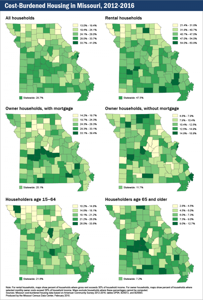
Approximately 30% of all Missouri households fall into the category of housing-cost burdened, spending 30% or more of gross income on housing costs. Nearly 50% of households that rent are housing-cost burdened, whereas a quarter of owner-occupied households making a mortgage payment are similarly cost burdened.

Approximately one in five households led by householders younger than 65 are cost burdened, and approximately 7% of senior householders fall into this category.

A careful consideration of these maps provides some surprises to the conventional wisdom that housing costs tend to be greater in higher-population-density areas. It’s important to keep in mind that the housing-cost burdened indicator is measuring the ratio of household income required for shelter to what is available for other household needs. Simply, whereas housing costs and values do tend to be higher in more population-dense areas, wages tend to be too. When considering the distribution by quintiles across Missouri counties, generally, southern Missouri households are more likely to be cost burdened compared to their rural northern Missouri neighbors. As a region, the Lake of the Ozarks/Truman Lake area is the densest area of cost-burdened owner-occupied housing as well as senior housing, at least partially accounted for by the region’s desirability as a retirement and/or second home destination. For seniors, the Branson area also has a high percent of both senior and renter households paying 30% or more of their gross household income on housing costs. The I-70 corridor, including Kansas City, Columbia, and the St. Louis metropolitan area tends to be most expensive for renters and households under 65.

Map of the Month

Educational Attainment in Missouri

Levels of educational attainment play a key role in determining long-term outcomes for individuals, households, communities, and even regional economies. One’s level of education plays an important role in one’s risk for unemployment as well as bounding opportunities for earnings and income.

Educational Attainment in Missouri, 2016

The chart, Unemployment rate and earnings by educational attainment, 2016, from the U.S. Bureau of Labor Statistics captures inverse correlation between risk of unemployment and median earnings by highest level of education achieved. In short, the more education one has, the less likely one is to be unemployed as well as to earn higher median wages. Those with less than a high school diploma are approximately twice as likely or more to be unemployed as those with an associate’s degree or higher, whereas those with an associate’s degree earn a median income that is half as much or less than those with a professional or doctoral degree.

The three maps in this series provide a geographic representation of:

  • less than a high school diploma,
  • a high school diploma, some college with no degree, or an associate’s degree, and
  • a bachelor’s degree or greater

These patterns illustrate the strengths and challenges faced within regions of our state in regard to economic viability, job and employment growth, and workforce readiness.

Map of the Month

Missouri’s Registered Voters — Where Are They?

For the upcoming November 8 Election Day, this month we present a view of registered voters in Missouri.

Missouri registered voters in 2013

Looking at the map (left) of registered voters in 2013 as a percentage of total county population ages 18 and older, we see some interesting patterns. The areas around Kansas City and St. Louis represent two large blocks of registered voters, but that shouldn’t surprise anyone, because those places represent the two largest concentrations of people in the state. (The map on the right shows where Missourians aged 18 and older live.)

What about the rest of the state, though? Dade County stands out with a fairly high percentage of registered voters, but neither Boone nor Cole counties are in the top tier of voter registration. Then there are counties with lower total populations but higher registration rates: Carter, Chariton, Clark, Gentry, Reynolds, Shelby, Ste. Genevieve, and Worth are all in the highest tier of voter registration, despite not being highly populated.

What’s the point? In addition to the usual message of “every vote counts,” these two maps show that large populations do not necessarily translate to large voter populations. This will make for some interesting viewing once the returns start coming in on Election Day. Keep in mind, too, that this map of voter registration rates can be compared to a map of voter turnout to see whether these patterns remain the same. That’s a comparison for another month.

Map of the Month

What Does Half of Missouri Look Like?

According to the U.S. Census, Missouri had a population of 5,988,927 people in 2010. Where do they all live, though? What is the fewest number of counties required to represent half of the population? Or the fewest number of census blocks? Or, with 2016 being an election year, the fewest number of voter tabulation districts?

What does half of Missouri look like?

In each case, it turns out that you don’t need that many. If you were collecting counties, you would need only seven — Clay, Greene, Jackson, Jefferson, St. Charles, St. Louis, and St. Louis City. That’s just 6% of Missouri’s total of 115 counties.

Voter tabulation districts tell a similar story. To get to half of Missouri’s population, you would need only 941 of the 4,813 districts in the state, or roughly 19%.

Most starkly of all, out of Missouri’s 343,565 census blocks, you would need only 5.3%, or 18,455, to represent half the state’s population.

Census Bureau Releases New County Estimates with Components of Change

This is the first in a series of three major substate estimate products to be released in the first half of 2014. Key items in this set include the 2013 estimated total population for each state, county, and metropolitan and micropolitan statistical areas (CBSAs). These products contain annual estimates (July 1, 2010 – July 1, 2013) and report components of change (births, deaths, migration) for each year since 2010 plus April–June, 2010. The five new datasets (mocom13, mocom13t, uscom13, uscomcbsas13, and mocomregns13) are available in the MCDC data warehouse. These datasets are all the same as last year but now include data through 2013 rather than 2012.

Missouri halts two-year rapid outmigration trend

The new estimates show that the state of Missouri added almost 20,000 new residents in the year July 1, 2012 – July 1, 2013. The data also show that the increase was due entirely to natural increase (births minus deaths), with net migration (persons moving into the state minus persons moving out) still showing a net loss (outmigration) of 700 persons.

While a loss of 700 people is no cause for celebration (for most people; there are those who think fewer people is a good thing) it breaks a two-year losing streak that was almost ten times worse. In the previous two years, the state lost an average of about 6,500 persons. In nine of the ten years prior to that, the state had a net in-migration of more than 10,000 (with a 9,305 increase in the worst of those years, 2007–2008).

See the entire report here.

Other interesting Missouri trends shown in the new estimates

  • Boone County had its 13th consecutive year with at least 2,000 population added and more than 1,000 net in-migration. However, the total increase was down by more than 400 from the previous year and was the smallest increase since 2000–2001.
  • The City of St. Louis had its worst year since since 2006–2007, when it lost more than 2,000 population. The loss this year (2012–2013) was only 696, but it came on the heels of two post-census years where the total loss had been only 145. Also, two years prior to that, St. Louis City had actually added about 1,300 people. These numbers (prior to 2010) are the intercensal adjustment figures, so they reflect a significant adjustment to the city’s population based on the results of the 2010 census, which showed that the city’s estimate challenges during the previous decade resulted in overestimates.
  • The top 5 counties based on population added over the last 3¼ years (4/1/2010 – 7/1/2013) were St. Charles (13,010), Greene (8,696), Clay (8,534), Boone (8,131), and Jackson (5,838). Boone had the largest percentage increase (5.0%), with Christian County second (4.5%). The top five ranked by change in the most recent year were the same, although Jackson and Boone switched ranks.
  • The five biggest losers of population since the 2010 census were Jasper (-1,006), St. Louis City (-940), Stone (-905), New Madrid (-595), and McDonald (-525). Note that three of these five counties are located in the far southwest corner of the state.
  • Counties within Metropolitan Statistical Areas in the state have shown a growth of 59,385 (1.3%) since the 2010 census, whereas those within Micropolitan SAs added only 4,375 people (0.6%). The 59 counties in the state that are outside any metro- or micropolitan area had a net loss of 8,512 people (-1.0%).
  • We created the mocomregns13 data set to summarize these trends by various county-based regions in Missouri. One of the region types included is Regional Planning Commissions (RPCs). The five RPCs with the greatest population gain since the 2010 census were Mid-America (Kansas City area, 19,068), East-West Gateway (St. Louis area, 17,615), Southwest Missouri COG (Springfield area, 12,248), Mid-Missouri (Columbia area, 9,170) and SEMO RPC (Cape Girardeau area, 2,277). The three RPCs with the greatest population loss were Green Hills, Kaysinger Basin and Bootheel.
  • Missouri ranks 18th in total population in 2013 (same rank as in 2010) and 26th in population change since the 2010 census (40th in percent change over that period). The state ranks 47th in net migration since the last census. That puts us just behind 46th-ranked New York (but they have a much larger population, and much of their out-migration is for retirement), and ahead of the nation’s four biggest losers: Mississippi (48), Ohio (49), Michigan (50) and Illinois (51).

In case anyone is interested, we got all these numbers by accessing the new uscom13 data set in the popests data directory using Uexplore/Dexter, filtering to get just state level summaries (sumlev = 040), keeping the relevant variables, and passing it all to Rankster to do the rankings for us.