MCDC News and Updates

Census Report

Gap Between Higher- and Lower-Wealth Households Widens

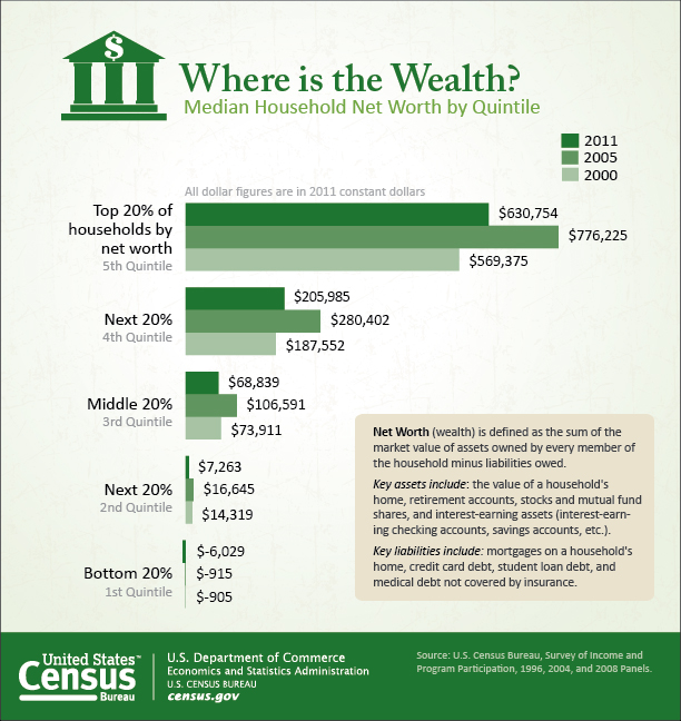
Median net worth increased between 2000 and 2011 for households in the top two quintiles of the net worth distribution — the wealthiest 40% of households — while declining for those in the lower three quintiles, according to statistics released recently by the U.S. Census Bureau. (Each quintile represents 20%, or one fifth, of all households.) The result: A widening wealth gap between those at the top and those in the middle and bottom of the net worth distribution.

Median household net worth by quintile, 2000-2011

According to the report, Distribution of Household Wealth in the U.S.: 2000 to 2011, median household net worth decreased by $5,124 for households in the lowest-net-worth quintile and increased by $61,379 (10.8%) for those in the highest quintile. Median net worth of households in the highest quintile was 39.8 times higher than the second lowest quintile in 2000, and it rose to 86.8 times higher in 2011.

The report also details a widening of the wealth gap for households sharing the same demographic characteristics, such as age, race and Hispanic origin, and educational attainment of the householder. For example, the median net worth for non-Hispanic whites in the highest quintile was 21.8 times higher than for those in the second-lowest quintile in 2000; in 2011, this had increased to 31.5 times higher. For blacks, the ratio increased from 139.9 to 328.1, and for Hispanics, the increase was from 158.4 to 220.9.

Between 2000 and 2011, the wealth gap has also widened between groups with different demographic characteristics. For example, the ratio of median net worth of non-Hispanic whites to that of blacks rose from 10.6 to 17.5 between 2000 and 2011, and the ratio of non-Hispanic whites to Hispanics also increased from 8.1 to 14.4.

“However, when looking at the highest quintile for these groups, we see that blacks experienced higher relative increases in median net worth than non-Hispanic whites and Hispanics,” Census Bureau economist Marina Vornovitsky said. For blacks in the highest quintile, median net worth increased by 62.8%, to $229,041; for Hispanics in the highest quintile, it increased by 17.9% to $250,462, and for non-Hispanic whites in the highest quintile, it rose by 11.9% to $754,244.

The Distribution of Household Net Worth and Debt in the U.S. detailed table packages were released for 2000, 2002, 2004, 2005, 2009, 2010 and 2011, the years for which data were collected.

Census Report

State of the Nation’s Senior Population

A recent report by the U.S. Census Bureau provides a comprehensive look at the nation’s 40+ million persons aged 65 and older.

The 192-page report, 65+ in the United States: 2010, contains many findings about the senior population on topics such as socioeconomic characteristics, size and growth, geographic distribution, and longevity and health. The report incorporates research from many recent studies that draw heavily from the 2010 Census and nationally representative surveys, such as the Current Population Survey, American Community Survey, and National Health Interview Survey.

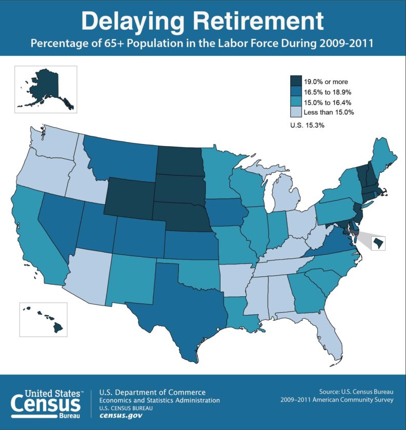
Percent seniors in labor force, 2009-2011

Some highlights of the report:

  • Size and growth: In 2010, there were 40.3 million people in the U.S. aged 65 and older — 12 times the number in 1900. Eleven states had more than one million people 65 and older in 2010.
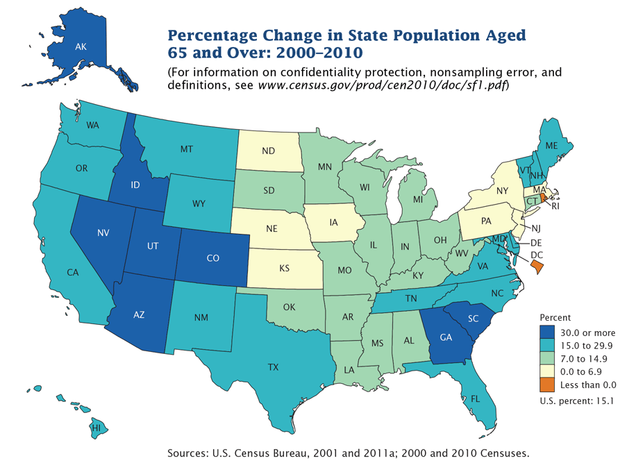
  • Geographic distribution: Florida was among the states with the highest proportions of older people in their populations in 2010, along with West Virginia, Maine, and Pennsylvania (all above 15%). The West and South regions experienced the fastest growth in their 65+ and 85+ populations between 2000 and 2010. Sumter county, Florida — home to a large retirement community — had the nation’s highest median age among all U.S. counties in 2013, at 65.5 years.
  • Elder care: The number of Americans 65+ living in a nursing home fell 20% between 2000 and 2010, from 1.6 million to 1.3 million. Meanwhile, the share in other care settings has been growing. (Economic statistics from the Census Bureau’s 2012 County Business Patterns also show changes in health care-related industries. For example, the number of employees in long-term care facilities grew by about 12% between 2007 and 2012.)
  • Labor force participation: Major retirement destinations, such as Arizona and Florida, had lower 65+ labor force participation rates compared with Midwest states, such as Nebraska, North Dakota, and South Dakota, where a higher share of the older population was still part of the workforce. “In the United States, older men and women are increasingly participating in the labor force,” said Enrique Lamas, the Census Bureau’s associate director for demographic programs.
  • Home ownership: Following 2006 and the peak in housing prices, home ownership rates remained stable for older householders at 81% in 2011, compared with the under-65 population who experienced declines.
  • Employment: Many older workers remained employed during the 2007-2009 recession. 16.2% of the 65+ population were employed in 2010, up from 14.5% in 2005. (By contrast, 60.3% of the 20–24 age group were employed in 2010, down from 68% in 2005.)
  • Internet usage: Between 2000 and 2010, Internet usage for the 65+ population increased from 14.3% to 44.8%.

Percent change in senior population, 2000-2010

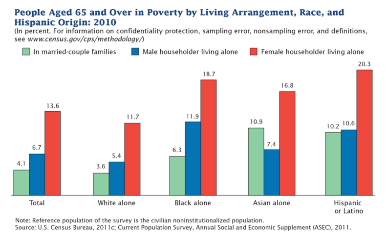
Senior poverty, 2010

The Division of Behavioral and Social Research at the National Institute on Aging (NIA) commissioned this report and has also supported three earlier editions, the first published in 1993. “This report series uniquely combines Census Bureau and other federal statistics with findings from NIA-supported studies on aging,” said Richard Suzman, director of the Division of Behavioral and Social Research at NIA. “The collaboration with Census has been of great value in developing social, economic and demographic statistics on our aging population with this edition highlighting an approaching crisis in caregiving — since the baby boomers had fewer children compared to their parents.”


ACS Report

One Quarter of U.S. Residents Live in Poverty Areas

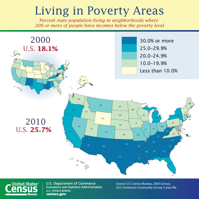
A new report from the U.S. Census Bureau’s American Community Survey (ACS) shows that one in four U.S. residents now live in poverty areas — up from fewer than one in five in 2000.

A “poverty area” is defined as any census tract with a poverty rate of 20% or more.

The number of people living in poverty areas increased from 49.5 million (18.0%) in 2000 to 77.4 million (25.7%) in 2008-2012. The overall U.S. poverty rate was 14.9% for the same period.

Percent living in poverty areas by state, 2010

By state, the percentage of people living in a poverty area ranged from 6.8% in New Hampshire to 48.5% in Mississippi. Several states saw declines over the period: District of Columbia (-6.7%), Louisiana (-3.6%), West Virginia (-2.3%), Alaska (-0.4%), Hawaii (-1.0%), and Alaska (-0.4%). On the other hand, North Carolina (17.9%), Oregon (16.0%), Tennessee (16.0%), Arkansas (15.7%), and Georgia (14.6%) had the largest increases in the proportion of people living in poverty areas.

More than half of people living in poverty lived in a poverty area, and about 30% of people living in poverty areas had incomes below the poverty level.

The report, Changes in Areas with Concentrated Poverty: 2000 to 2010, uses data from the 2000 Census and the 2008-2012 ACS five-year estimates to analyze changes in the spatial distribution and socioeconomic characteristics of people living in poverty areas.

According to the report’s author, Alemayehu Bishaw of the Census Bureau’s Poverty Statistics Branch: “Researchers have found that living in poor neighborhoods adds burdens to low-income families, such as poor housing conditions and fewer job opportunities. Many federal and local government agencies use the Census Bureau’s definition of poverty areas to provide much-needed resources to communities with a large concentration of people in poverty.”

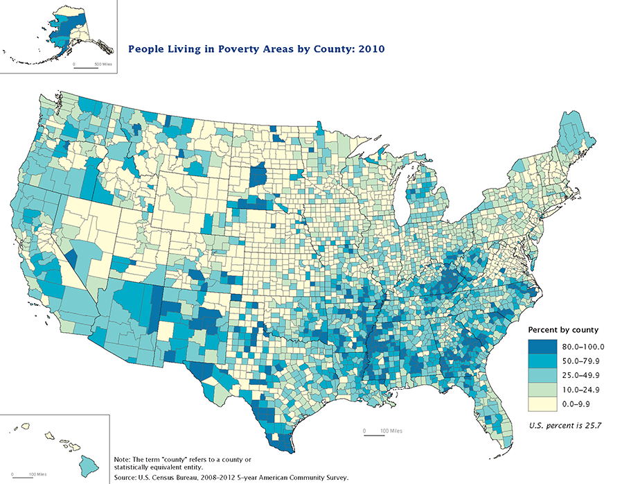
People living in poverty areas by county, 2010

Other highlights of the report:

  • Missouri’s percentage of people living in poverty areas (24.9%) is just slightly lower than the national rate and represents a change of 9.9% over the period.
  • In the 2008-2012 period, in 14 states and D.C., 30% or more of the population lived in poverty areas. In 2000, this was true of four states and D.C.
  • Of the people living in poverty areas in the 2008-2012 period, 51.1% lived in central cities of metro areas, 28.6% in suburbs and 20.4% outside metro areas.
  • Many of the counties with 80% or more of the population living in poverty areas were clustered in and around American Indian reservations (in New Mexico, Arizona, South Dakota, and North Dakota) or in the Mississippi Delta region (including portions of Mississippi, Louisiana, and Arkansas).
  • About 38% of all families headed by a female householder with no husband present lived in a poverty area — the largest proportion among all family types.
  • Blacks, American Indians and Alaska Natives, and those in the “some other race” category were the race groups most likely to live in poverty areas, at 50.4%, 47.8%, and 48.3%, respectively. Whites, however, experienced the largest increase in the proportion living in poverty areas, from 11.3% in 2000 to 20.3% in 2008-2012.
  • Employed people saw a larger increase (8.0%) than the unemployed (3.4%) in people living in poverty areas over this period.
  • The Midwest region experienced the largest increase over the period (9.8%).

Census Bureau Releases New County Estimates with Components of Change

This is the first in a series of three major substate estimate products to be released in the first half of 2014. Key items in this set include the 2013 estimated total population for each state, county, and metropolitan and micropolitan statistical areas (CBSAs). These products contain annual estimates (July 1, 2010 – July 1, 2013) and report components of change (births, deaths, migration) for each year since 2010 plus April–June, 2010. The five new datasets (mocom13, mocom13t, uscom13, uscomcbsas13, and mocomregns13) are available in the MCDC data warehouse. These datasets are all the same as last year but now include data through 2013 rather than 2012.

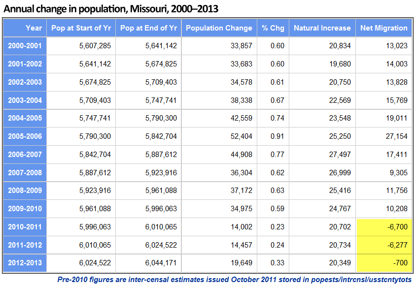
Missouri halts two-year rapid outmigration trend

The new estimates show that the state of Missouri added almost 20,000 new residents in the year July 1, 2012 – July 1, 2013. The data also show that the increase was due entirely to natural increase (births minus deaths), with net migration (persons moving into the state minus persons moving out) still showing a net loss (outmigration) of 700 persons.

While a loss of 700 people is no cause for celebration (for most people; there are those who think fewer people is a good thing) it breaks a two-year losing streak that was almost ten times worse. In the previous two years, the state lost an average of about 6,500 persons. In nine of the ten years prior to that, the state had a net in-migration of more than 10,000 (with a 9,305 increase in the worst of those years, 2007–2008).

See the entire report here.

Other interesting Missouri trends shown in the new estimates

  • Boone County had its 13th consecutive year with at least 2,000 population added and more than 1,000 net in-migration. However, the total increase was down by more than 400 from the previous year and was the smallest increase since 2000–2001.
  • The City of St. Louis had its worst year since since 2006–2007, when it lost more than 2,000 population. The loss this year (2012–2013) was only 696, but it came on the heels of two post-census years where the total loss had been only 145. Also, two years prior to that, St. Louis City had actually added about 1,300 people. These numbers (prior to 2010) are the intercensal adjustment figures, so they reflect a significant adjustment to the city’s population based on the results of the 2010 census, which showed that the city’s estimate challenges during the previous decade resulted in overestimates.
  • The top 5 counties based on population added over the last 3¼ years (4/1/2010 – 7/1/2013) were St. Charles (13,010), Greene (8,696), Clay (8,534), Boone (8,131), and Jackson (5,838). Boone had the largest percentage increase (5.0%), with Christian County second (4.5%). The top five ranked by change in the most recent year were the same, although Jackson and Boone switched ranks.
  • The five biggest losers of population since the 2010 census were Jasper (-1,006), St. Louis City (-940), Stone (-905), New Madrid (-595), and McDonald (-525). Note that three of these five counties are located in the far southwest corner of the state.
  • Counties within Metropolitan Statistical Areas in the state have shown a growth of 59,385 (1.3%) since the 2010 census, whereas those within Micropolitan SAs added only 4,375 people (0.6%). The 59 counties in the state that are outside any metro- or micropolitan area had a net loss of 8,512 people (-1.0%).
  • We created the mocomregns13 data set to summarize these trends by various county-based regions in Missouri. One of the region types included is Regional Planning Commissions (RPCs). The five RPCs with the greatest population gain since the 2010 census were Mid-America (Kansas City area, 19,068), East-West Gateway (St. Louis area, 17,615), Southwest Missouri COG (Springfield area, 12,248), Mid-Missouri (Columbia area, 9,170) and SEMO RPC (Cape Girardeau area, 2,277). The three RPCs with the greatest population loss were Green Hills, Kaysinger Basin and Bootheel.
  • Missouri ranks 18th in total population in 2013 (same rank as in 2010) and 26th in population change since the 2010 census (40th in percent change over that period). The state ranks 47th in net migration since the last census. That puts us just behind 46th-ranked New York (but they have a much larger population, and much of their out-migration is for retirement), and ahead of the nation’s four biggest losers: Mississippi (48), Ohio (49), Michigan (50) and Illinois (51).

In case anyone is interested, we got all these numbers by accessing the new uscom13 data set in the popests data directory using Uexplore/Dexter, filtering to get just state level summaries (sumlev = 040), keeping the relevant variables, and passing it all to Rankster to do the rankings for us.