MCDC News and Updates

ACS Report

Nearly a Quarter of Veterans Live in Rural Areas

About five million (24.1%) U.S. veterans 18 years and older lived in areas designated as rural between 2011 and 2015, according to a new report (Veterans in Rural America: 2011–2015) from the U.S. Census Bureau’s American Community Survey (ACS). The report found that when considering demographic and economic characteristics, rural veterans were similar to urban veterans except for their median household income and employment rates.

Rural veterans had median household incomes more similar to those of rural nonveterans than urban veterans ($53,554 compared with $52,161 and $59,674, respectively). The poverty rate for all rural veterans was 6.9%. This rate increased by level of rurality, to a high of 8.6% for veterans in completely rural counties. Level of rurality is based on the percentage of the county population living in rural areas.

Working-age rural veterans (18-64 years old) had an employment rate of 66.0%, lower than rural nonveterans and urban veterans (67.7% and 70.7%, respectively). The employment rate of rural veterans decreased as the level of rurality increased. Employed rural veterans, however, were more likely to work full time and year-round than rural nonveterans (81.6% compared with 71.5%).

These findings use the ACS 5-year statistics released on December 8. Other highlights include:

Geography

Just under half of all rural veterans lived in the South (45.9%), followed by 26.4% in the Midwest, 14.1% in the West, and 13.7% in the Northeast.

Age

The median age of rural veterans was about 15 years higher than rural nonveterans and two years higher than urban veterans, and their age increased as the level of rurality increased. Rural veterans living in counties that were completely rural were the oldest, with a median age of 66.

Health Insurance

During the 2011-2015 period, 5.2% of all rural veterans and 15.4% of all rural nonveterans were not covered by any type of health insurance plan. Of the rural veterans who had health insurance during this period, 30.3% had private insurance only, 24.6% had public insurance only, and the remainder (45.1%) had a combination of private and public insurance.

New data application shows population by age and demographics

A new MCDC data application, Population Estimates by Age and Demographics, provides population data at the state and county level for multiple age cohorts, data years, and demographic groups. These data are based on US Census populations with special “bridged race” categories created by the Census Bureau for the National Center for Health Statistics (NCHS).

The new application allows users to select one or more states (including counties, for single-state selections), data years (1990–2015), demographic groups, and age cohorts. There are two predefined age cohort sets, and users may also define up to 20 custom age cohorts, including both single year of age and multi-year age ranges. Age ranges may overlap.

This application complements our other population estimates apps, in particular the Population Trends app, which uses the same NCHS source data to compare population estimates between two data years. However, the Population Trends application is simpler, using only predefined age cohorts and a more limited set of data years and demographic groups. This new application offers more options and an Excel data export feature.

We hope you find this a useful tool. Please contact us with any problems, bugs, or suggestions.

Map of the Month

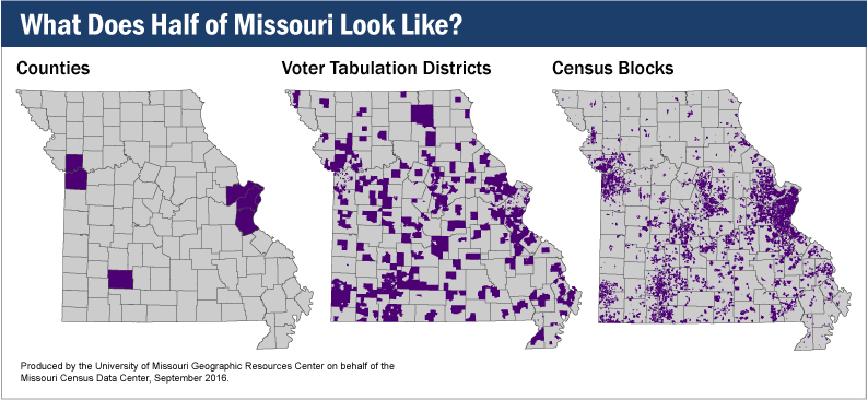
What Does Half of Missouri Look Like?

According to the U.S. Census, Missouri had a population of 5,988,927 people in 2010. Where do they all live, though? What is the fewest number of counties required to represent half of the population? Or the fewest number of census blocks? Or, with 2016 being an election year, the fewest number of voter tabulation districts?

What does half of Missouri look like?

In each case, it turns out that you don’t need that many. If you were collecting counties, you would need only seven — Clay, Greene, Jackson, Jefferson, St. Charles, St. Louis, and St. Louis City. That’s just 6% of Missouri’s total of 115 counties.

Voter tabulation districts tell a similar story. To get to half of Missouri’s population, you would need only 941 of the 4,813 districts in the state, or roughly 19%.

Most starkly of all, out of Missouri’s 343,565 census blocks, you would need only 5.3%, or 18,455, to represent half the state’s population.

Census Report

Nearly One in Five Movers Relocate to a Different Metro Area

About 18% of all movers in the United States and Puerto Rico, totaling 8.5 million people, moved to a different metropolitan area in the last year, according to new statistics released today by the U.S. Census Bureau. This is the first time that the Census Bureau has released statistics for movers between metro areas from the American Community Survey.

The migration flows tables, which use data collected between 2009 and 2013, show how many residents move from one county or metro area to another during the course of a year. Government officials and planners, as well as local businesses, use these statistics to understand residential turnover in their communities. They also use this information to plan for infrastructure for new residents when there is a trend in people arriving, or to plan programs that attract new residents or employers when there is a trend in people leaving.

Nine of the top 10 metro migration flows were moves to nearby metro areas, with the largest flow of about 90,000 moving from the Los Angeles metro to the Riverside metro area. Movers who left the New York City metro area for the Miami metro area were the exception, with about 22,000 people making this move.

In addition to the new metro-to-metro migration flow tables, the annual county-to-county migration flow tables are now available. The county flows can also be accessed through the Census Flows Mapper.

The migration flow tables for both county-to-county and metro-to-metro include characteristics of movers by ability to speak English, place of birth, and years living in the United States.

Metro-to-Metro Migration Highlights

Of the 8.5 million people who moved between metropolitan areas:

  • 8.4 million moved between metro areas within the United States.
  • 63,483 moved from a metro area in Puerto Rico to a metro area in the U.S.
  • 24,197 moved from a metro area in the United States to a metro area in Puerto Rico.
  • 18,918 moved between metro areas within Puerto Rico.

Among the largest migration flows between metro areas:

  • 90,494 moved from the Los Angeles metro area to the Riverside, Calif., metro area.
  • 54,711 moved from the Riverside metro area to the Los Angeles metro area.
  • 26,957 moved from the New York metro area to the Philadelphia metro area.

County-to-County Migration Highlights

There were about 16.7 million people, or 5.4% of the U.S. population age 1 or over, who lived in a different county within the U.S. one year earlier.

Among the largest migration flows between counties by selected characteristics:

  • 7,690 people who speak a language other than English and speak English “less than very well” moved from Los Angeles County to San Bernardino County, Calif.
  • 12,190 people who speak a language other than English and speak English “very well” moved from Los Angeles County to Orange County, Calif.
  • 2,968 people moved from Clark County, Nev., to their state of birth (California) and now reside in Los Angeles County.
  • 4,948 people who were born in Mexico moved from Los Angeles County to San Bernardino County.
  • 2,468 people who entered the U.S. five years ago or less moved from Miami-Dade County to Broward County, Fla.
  • 6,263 people who entered the U.S. 16 years ago or more moved from Los Angeles County to Orange County, Calif.

Map of the Month

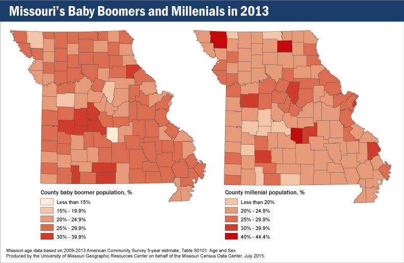
Millennials and Baby Boomers in Missouri

In late June 2015, an news release from the U.S. Census Bureau indicated that, among other distinctions, Millennials — typically identified as persons born between 1982 and 2000 — officially outnumbered Baby Boomers — individuals born between 1946 and 1964. According to the Bureau, not only are Millennials now more numerous than Baby Boomers in the United States, they actually represent more than one quarter of the nation’s population.

Baby boomers and millenials in Missouri, 2013

On a county-by-county basis, Missouri does not follow the national trend. Of Missouri’s 115 counties, only 37 have higher percentages of Millennials than Baby Boomers. Two counties, Webster and St Louis, actually report equal populations of Baby Boomers and Millennials. As can be reasonably expected, most of these younger populations are found in areas of Missouri that include, or are near, metropolitan areas. Kansas City, St Louis City, Springfield, Boone County (and all of its neighboring counties) all possess noticeably more youthful populations than the rest of the state. Although most Missouri counties are estimated to have more Baby Boomers than Millennials, an interesting discovery in the county-level age data is that the difference between the two populations is often very small. Of the 74 counties that have more Baby Boomers than Millennials, only eight counties display a difference between the two populations of 10% or greater.

Census Report

10% of Grandparents Live with a Grandchild

Of the 65 million grandparents in the United States in 2012, nearly seven million (10%) lived with at least one grandchild, according to Coresident Grandparents and Their Grandchildren: 2012, a new report from the U.S. Census Bureau.

About 4.2 million households (3% of all households) contained both grandchildren under 18 and their grandparents in 2012. More than 60% of these households were maintained by a grandparent and about one in three had no parent present.

In 2012, 2.7 million grandparents in the U.S. were raising their grandchildren. About 39% of these grandparent caregivers have cared for their grandchildren for five years or more.

The new report uses data from the 2010 Census, the American Community Survey, the Current Population Survey, and the Survey of Income and Program Participation to examine historical changes in coresidence of grandparents and characteristics of grandparents and grandchildren who live together.

Other findings:

  • Grandparents who lived with a grandchild in 2012 were younger, had lower levels of education and were more likely to be in poverty than those who did not live with a grandchild.
  • Two percent of grandparents who lived with a grandchild were age 30–39, whereas the highest percentage was for those age 50–59 (34%). Those age 80 and over made up only 4%.
  • Women comprised 64.2% of grandparents who lived with their grandchildren.
  • Forty-nine percent of children in grandparent-maintained households lived with both grandparents compared with only 19% of children in parent-maintained households.
  • Since 2007, about one-third of children who lived with a grandparent also had two parents present.

New American Community Survey Data Released for 2013

The 2013 American Community Survey (ACS), released today in its one-year version, provides a multitude of statistics that measure the social, economic and housing conditions of U.S. states, counties, and communities. More than 40 topics are available with today’s release, such as educational attainment, housing, employment, commuting, language spoken at home, nativity, ancestry and selected monthly homeowner costs.

The ACS gives communities the current information they need to plan investments and services. Retailers, homebuilders, police departments, and town and city planners are among the many private- and public-sector decision makers who count on these annual results.

“The American Community Survey is our country’s only source of small area estimates for social and demographic characteristics,” Census Bureau Director John H. Thompson said. “As such, it is indispensable to our economic competitiveness and used by businesses, local governments and anyone in need of trusted, timely, detailed data.”

Also released today are two reports providing analysis on income and poverty for states and large metropolitan areas. The ACS three- and five-year data for 2013 will be released in October and December of this year, respectively.

Following are some highlights of the new ACS 2013 one-year release and related reports.

Income

  • For 2013, median household incomes were lower than the U.S. median ($52,250) in 28 states and higher in 19 states and D.C. (Three states did not have a statistically significant difference from the U.S. as a whole.)
  • In 2013, the states with the highest median household incomes were Maryland ($72,483) and Alaska ($72,237). Mississippi had the lowest ($37,963).
  • Median household income among the 25 most populous metro areas was highest in the Washington, D.C. ($90,149), San Francisco ($79,624), and Boston ($72,907) metro areas.

Income Inequality

Household Income: 2013 examined the Gini index for states and large metro areas. The Gini index is a summary measure of income inequality, ranging from 0 (complete equality) to 1 (complete inequality). Among the findings:

  • Five states and D.C. had Gini indexes higher than the U.S. index of .481; 36 states had lower Gini indexes than the U.S.
  • The Gini index of 15 states increased from 2012 to 2013. Alaska was the only state to have a decrease. All other states saw no significant change.
  • The highest Gini index was in the District of Columbia (0.532). Alaska’s (0.408) was among the lowest.

Poverty

  • Two states — New Hampshire and Wyoming — saw a decline in both the number and percentage of people in poverty. New Hampshire’s poverty rate declined from 10% in 2012 to 8.7% in 2013. Wyoming’s rate declined from 12.6% to 10.9%.
  • Three states saw increases in both the number and percentage of people in poverty between 2012 and 2013. New Jersey’s poverty rate increased from 10.8% in 2012 to 11.4% in 2013; New Mexico increased from 20.8% to 21.9%, and Washington increased from 13.5% to 14.1%.
  • In 2013, Mississippi had the highest poverty rate among states (24%), followed by New Mexico (21.9%). Both states also had the highest percentage of the population below 125% of the poverty level: 30.3% in Mississippi and 28.3% in New Mexico. About one in 10 people in both states had incomes less than 50% of the poverty level.
  • Among large metropolitan areas, one of the lowest proportions of people with incomes less than 50% of the poverty level in 2013 was 4.2% in the Washington, D.C., metro area, while one of the highest proportions was 8.4% in the Phoenix metro area.

Health Insurance

  • Between 2012 and 2013, 13 states and Puerto Rico saw a statistically significant increase in the percentage of civilians covered by health insurance. Two states (Maine and New Jersey) saw a decrease.
  • Among people whose incomes were below 138% of the poverty threshold, 25.6% were uninsured in 2013. (Under the Affordable Care Act, states have the option of expanding Medicaid eligibility to those with incomes at or below 138% of the poverty threshold.) Among people whose incomes were at or above 200% of the poverty threshold, 9.2% were uninsured in 2013.
  • Among the top 25 largest U.S. metropolitan areas, the uninsured rates were highest in Miami (24.8%), Houston (22.8%), and Dallas (21.5%) and lowest in Boston (4.2%), Pittsburgh (7.5%), Minneapolis (8.1%), and Baltimore (8.7%).
  • Among the top 25 large metropolitan areas, Tampa, Detroit, and Riverside, Calif., had public coverage rates of 33% or higher.

Computer and Internet Access

The 2013 American Community Survey included new questions to produce statistics on computer and Internet access. Mandated by the 2008 Broadband Data Improvement Act, the data will help the Federal Communications Commission measure broadband access nationwide. The data will also help identify communities eligible for available grants to expand access.

Some findings: 83.8% of the nation’s households have a computer (either desktop, laptop, tablet or smartphone). 74.4% have some form of Internet access at home. The Census Bureau is releasing a more detailed report on the new findings in early October.

Census Bureau Releases New County Estimates with Components of Change

This is the first in a series of three major substate estimate products to be released in the first half of 2014. Key items in this set include the 2013 estimated total population for each state, county, and metropolitan and micropolitan statistical areas (CBSAs). These products contain annual estimates (July 1, 2010 – July 1, 2013) and report components of change (births, deaths, migration) for each year since 2010 plus April–June, 2010. The five new datasets (mocom13, mocom13t, uscom13, uscomcbsas13, and mocomregns13) are available in the MCDC data warehouse. These datasets are all the same as last year but now include data through 2013 rather than 2012.

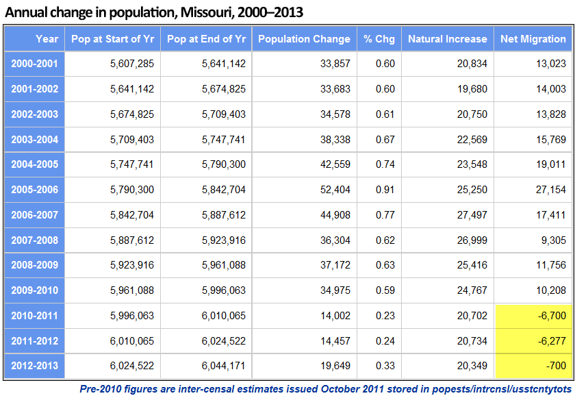
Missouri halts two-year rapid outmigration trend

The new estimates show that the state of Missouri added almost 20,000 new residents in the year July 1, 2012 – July 1, 2013. The data also show that the increase was due entirely to natural increase (births minus deaths), with net migration (persons moving into the state minus persons moving out) still showing a net loss (outmigration) of 700 persons.

While a loss of 700 people is no cause for celebration (for most people; there are those who think fewer people is a good thing) it breaks a two-year losing streak that was almost ten times worse. In the previous two years, the state lost an average of about 6,500 persons. In nine of the ten years prior to that, the state had a net in-migration of more than 10,000 (with a 9,305 increase in the worst of those years, 2007–2008).

See the entire report here.

Other interesting Missouri trends shown in the new estimates

  • Boone County had its 13th consecutive year with at least 2,000 population added and more than 1,000 net in-migration. However, the total increase was down by more than 400 from the previous year and was the smallest increase since 2000–2001.
  • The City of St. Louis had its worst year since since 2006–2007, when it lost more than 2,000 population. The loss this year (2012–2013) was only 696, but it came on the heels of two post-census years where the total loss had been only 145. Also, two years prior to that, St. Louis City had actually added about 1,300 people. These numbers (prior to 2010) are the intercensal adjustment figures, so they reflect a significant adjustment to the city’s population based on the results of the 2010 census, which showed that the city’s estimate challenges during the previous decade resulted in overestimates.
  • The top 5 counties based on population added over the last 3¼ years (4/1/2010 – 7/1/2013) were St. Charles (13,010), Greene (8,696), Clay (8,534), Boone (8,131), and Jackson (5,838). Boone had the largest percentage increase (5.0%), with Christian County second (4.5%). The top five ranked by change in the most recent year were the same, although Jackson and Boone switched ranks.
  • The five biggest losers of population since the 2010 census were Jasper (-1,006), St. Louis City (-940), Stone (-905), New Madrid (-595), and McDonald (-525). Note that three of these five counties are located in the far southwest corner of the state.
  • Counties within Metropolitan Statistical Areas in the state have shown a growth of 59,385 (1.3%) since the 2010 census, whereas those within Micropolitan SAs added only 4,375 people (0.6%). The 59 counties in the state that are outside any metro- or micropolitan area had a net loss of 8,512 people (-1.0%).
  • We created the mocomregns13 data set to summarize these trends by various county-based regions in Missouri. One of the region types included is Regional Planning Commissions (RPCs). The five RPCs with the greatest population gain since the 2010 census were Mid-America (Kansas City area, 19,068), East-West Gateway (St. Louis area, 17,615), Southwest Missouri COG (Springfield area, 12,248), Mid-Missouri (Columbia area, 9,170) and SEMO RPC (Cape Girardeau area, 2,277). The three RPCs with the greatest population loss were Green Hills, Kaysinger Basin and Bootheel.
  • Missouri ranks 18th in total population in 2013 (same rank as in 2010) and 26th in population change since the 2010 census (40th in percent change over that period). The state ranks 47th in net migration since the last census. That puts us just behind 46th-ranked New York (but they have a much larger population, and much of their out-migration is for retirement), and ahead of the nation’s four biggest losers: Mississippi (48), Ohio (49), Michigan (50) and Illinois (51).

In case anyone is interested, we got all these numbers by accessing the new uscom13 data set in the popests data directory using Uexplore/Dexter, filtering to get just state level summaries (sumlev = 040), keeping the relevant variables, and passing it all to Rankster to do the rankings for us.