- Population estimates reports updated to latest vintage (2017)
- County-to-county and state-to-state IRS migration profile applications updated to use latest vintage (2015-2016)
- acspums data added for 2016 and 2017.
Story Map
Missouri Voter Turnout in General Elections Since 2000
How many people in Missouri actually exercise their right to vote?
As Missourians get ready to head back to the polls for the 2018 midterm election, our colleagues at the Missouri Spatial Data Information Service built a story map showing voter turnout for previous Missouri general elections from 2000 through 2016.
The Missouri Census Data Center frequently works with MSDIS on mapping and data projects. MSDIS is a spatial data retrieval and archival system offering many mapping resources, primarily focused on the state of Missouri.
Map of the Month
Missouri Educational Attainment and Income
Educational attainment is an established, validated predictor of income. This map-of-the-month series looks at the distribution of both characteristics in Missouri’s counties. Derived from the U.S. Census Bureau, American Community Survey (ACS) 2012-2016 5-year data, Missouri households are mapped here by level of educational attainment and median household income, while a bivariate choropleth map displays the variable impact of earning less than a high school diploma on household income.

The bar chart, based on the 2016 ACS 1-year release, establishes the relative distribution of median household income by level of education. While the overall median household in Missouri realizes approximately $36,000 in income, the median household in Missouri headed by someone without a high school diploma or GED is closer to $20,000. Completing high school results in a bump of roughly $10,000, with the median household income of high school graduates a little more than $30,000. Completing some college or an associate’s (2-year degree) results in an incremental increase in household median income to the mid-$30,000 range, but it is completion of a bachelor’s degree or greater that accelerates median household income into the mid-$40,000 to mid-$50,000 range annually.
Educational attainment, however, is not the only driver of income. Access to workforce opportunities and proximity to infrastructure impacts potential income too. Review of the Median household income map reveals the influence of infrastructure investment and population density in driving up wages and income, as seen in the counties shaded in the darkest green. It’s also interesting to visually note the geographically layered gradation of quantiles of the state with the I-70 highway corridor connecting Missouri’s relatively high income metropolitan areas, and the agricultural northern tier of counties falling into the mid-quantiles, while lower income households concentrate in the southern tier of counties (with exception of income concentrating in the Springfield metro area).
Not surprisingly, a close look at the concentrations of level of educational attainment (the blue-scale maps), correlate at the county level to the median household income map fairly predictably: Populations with higher concentrations of higher levels of education also have higher median household incomes.
The bivariate choropleth map, Median household income by percent of adults with less than high school diploma or GED, lets us see the outliers as well as validating the correlations we anticipated. For example, the truer the shade of blue a county is coded, the higher the percent of the adult population without a high school diploma/GED and the higher median household income indicating some combination of higher wage job and income opportunities relative to educational qualifications. We see these on the periphery of the other end of the spectrum, counties with higher median household incomes and the lowest rates of households with low educational attainment, suggesting “bedroom” communities. Further study to confirm this pattern might include looking at patterns of in-migration over time and commuting patterns.
Map of the Month
Housing-Cost-Burdened Households Across Missouri
The U.S. Census Bureau, in partnership with the federal department of Housing and Urban Development (HUD), calculate a measure of the percent of household gross income committed to paying for basic housing costs. If more than 30% of household gross income is spent on housing costs, a household is considered housing-cost burdened. The definition of cost burden considers monthly rental fees and utilities for rental housing and mortgage payments, second mortgage payments, utilities, real estate taxes, association fees, and homeowner’s insurance for owner-occupied households.
The concept of measuring a housing-cost burden emerged as a policy indicator during the implementation of the United State Housing Act of 1937 and has been used as a tool to understand trends in housing affordability trends since. Initially, a household was considered cost burdened if spending greater than 20% of household income on housing costs. The policy definition of cost burden has evolved over time. The currently used 30% was adopted in the early 1980s by HUD and has been used as a tool to inform both mortgage-lending policy as well as policy regarding supports for low-income, subsidized housing. Households paying greater than 50% of their gross income for housing are considered severely housing-cost burdened. The paper “Who Can Afford to Live in a Home”, published by the U.S. Census Bureau in 2006, provides a policy history and discussions of methodology and interpretation that remain useful.
The U.S. Census Bureau publishes 1- and 5-year estimates of this indicator with counties with populations of 60,000+ receiving annual estimates and smaller-population counties an annual 5-year estimate. In order to compare all Missouri counties, these maps consider the most recent 5-year estimate from 2012-2016. To understand the impact of housing-cost burdened households on Missouri’s communities, we have created six maps that consider:
- all households,
- rental households,
- owner-occupied households with a mortgage,
- owner-occupied households without a mortgage,
- households headed by those under age 65, and
- households headed by those age 65 and older.

Approximately 30% of all Missouri households fall into the category of housing-cost burdened, spending 30% or more of gross income on housing costs. Nearly 50% of households that rent are housing-cost burdened, whereas a quarter of owner-occupied households making a mortgage payment are similarly cost burdened.
Approximately one in five households led by householders younger than 65 are cost burdened, and approximately 7% of senior householders fall into this category.
A careful consideration of these maps provides some surprises to the conventional wisdom that housing costs tend to be greater in higher-population-density areas. It’s important to keep in mind that the housing-cost burdened indicator is measuring the ratio of household income required for shelter to what is available for other household needs. Simply, whereas housing costs and values do tend to be higher in more population-dense areas, wages tend to be too. When considering the distribution by quintiles across Missouri counties, generally, southern Missouri households are more likely to be cost burdened compared to their rural northern Missouri neighbors. As a region, the Lake of the Ozarks/Truman Lake area is the densest area of cost-burdened owner-occupied housing as well as senior housing, at least partially accounted for by the region’s desirability as a retirement and/or second home destination. For seniors, the Branson area also has a high percent of both senior and renter households paying 30% or more of their gross household income on housing costs. The I-70 corridor, including Kansas City, Columbia, and the St. Louis metropolitan area tends to be most expensive for renters and households under 65.
Map of the Month
Educational Attainment in Missouri
Levels of educational attainment play a key role in determining long-term outcomes for individuals, households, communities, and even regional economies. One’s level of education plays an important role in one’s risk for unemployment as well as bounding opportunities for earnings and income.
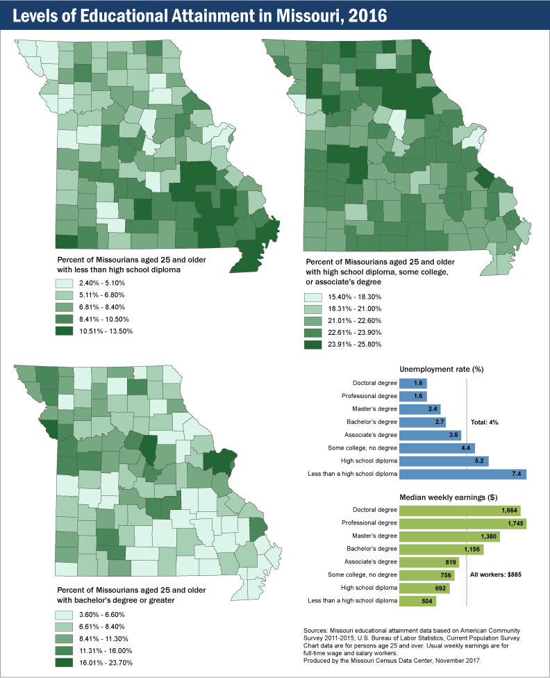
The chart, Unemployment rate and earnings by educational attainment, 2016, from the U.S. Bureau of Labor Statistics captures inverse correlation between risk of unemployment and median earnings by highest level of education achieved. In short, the more education one has, the less likely one is to be unemployed as well as to earn higher median wages. Those with less than a high school diploma are approximately twice as likely or more to be unemployed as those with an associate’s degree or higher, whereas those with an associate’s degree earn a median income that is half as much or less than those with a professional or doctoral degree.
The three maps in this series provide a geographic representation of:
- less than a high school diploma,
- a high school diploma, some college with no degree, or an associate’s degree, and
- a bachelor’s degree or greater
These patterns illustrate the strengths and challenges faced within regions of our state in regard to economic viability, job and employment growth, and workforce readiness.
Startups Created More Than Two Million Jobs in 2015
In 2015, the nation’s 414,000 startup firms created 2.5 million new jobs, according to data from the Census Bureau’s Business Dynamics Statistics (BDS). This level of startup activity is well below the pre-recession average of 524,000 startup firms and 3.3 million new jobs per year for the period 2002–2006.
Other BDS highlights include:
- Job creation in the U.S totaled 16.8 million and job destruction totaled 13.7 million, for a net job creation of 3.1 million in 2015.
- Young firms (those less than six years old) accounted for 11% of employment and 27% of job creation.
- Old firms (those more than 25 years old) comprised 62% of employment and 48% of job creation.
- The job creation rate for young firms, excluding startups, was 20% in 2015. This rate is above the Great Recession low of 15% in 2009, and it has recovered to its average level of 20% during the period 2002–2006.
- The net job creation rate for establishments* in metro areas was 2.7%. For establishments in nonmetro areas, the rate was lower at 1.2%.
- States with the highest net job creation rates in 2015 — 3.4% and above — are in the South Atlantic, Pacific and Mountain divisions.
The Business Dynamics Statistics are based on Business Register data, which covers all employers in the U.S. private nonfarm economy. This year’s release is limited to 13 tables; this temporary reduction in the number of tables will allow the completion of work to modernize the methodology that generates the Business Dynamics Statistics. The next release, planned for 2018, will provide an expanded set of tables that incorporate long-planned enhancements, including switching from the Standard Industrial Classification system to the North American Industry Classification System.
*A firm is a business organization consisting of one or more establishments under common ownership or control. An establishment is a single physical location where business is conducted or where services or industrial operations are performed. The firm and establishment are the same for single-establishment firms. Startup firms are new firms of age zero. See the BDS concepts and methodology page for definitions of job creation and net job creation rate.
ACS Report
Nearly a Quarter of Veterans Live in Rural Areas
About five million (24.1%) U.S. veterans 18 years and older lived in areas designated as rural between 2011 and 2015, according to a new report (Veterans in Rural America: 2011–2015) from the U.S. Census Bureau’s American Community Survey (ACS). The report found that when considering demographic and economic characteristics, rural veterans were similar to urban veterans except for their median household income and employment rates.
Rural veterans had median household incomes more similar to those of rural nonveterans than urban veterans ($53,554 compared with $52,161 and $59,674, respectively). The poverty rate for all rural veterans was 6.9%. This rate increased by level of rurality, to a high of 8.6% for veterans in completely rural counties. Level of rurality is based on the percentage of the county population living in rural areas.
Working-age rural veterans (18-64 years old) had an employment rate of 66.0%, lower than rural nonveterans and urban veterans (67.7% and 70.7%, respectively). The employment rate of rural veterans decreased as the level of rurality increased. Employed rural veterans, however, were more likely to work full time and year-round than rural nonveterans (81.6% compared with 71.5%).
These findings use the ACS 5-year statistics released on December 8. Other highlights include:
Geography
Just under half of all rural veterans lived in the South (45.9%), followed by 26.4% in the Midwest, 14.1% in the West, and 13.7% in the Northeast.
Age
The median age of rural veterans was about 15 years higher than rural nonveterans and two years higher than urban veterans, and their age increased as the level of rurality increased. Rural veterans living in counties that were completely rural were the oldest, with a median age of 66.
Health Insurance
During the 2011-2015 period, 5.2% of all rural veterans and 15.4% of all rural nonveterans were not covered by any type of health insurance plan. Of the rural veterans who had health insurance during this period, 30.3% had private insurance only, 24.6% had public insurance only, and the remainder (45.1%) had a combination of private and public insurance.
New data application shows population by age and demographics
A new MCDC data application, Population Estimates by Age and Demographics, provides population data at the state and county level for multiple age cohorts, data years, and demographic groups. These data are based on US Census populations with special “bridged race” categories created by the Census Bureau for the National Center for Health Statistics (NCHS).
The new application allows users to select one or more states (including counties, for single-state selections), data years (1990–2015), demographic groups, and age cohorts. There are two predefined age cohort sets, and users may also define up to 20 custom age cohorts, including both single year of age and multi-year age ranges. Age ranges may overlap.
This application complements our other population estimates apps, in particular the Population Trends app, which uses the same NCHS source data to compare population estimates between two data years. However, the Population Trends application is simpler, using only predefined age cohorts and a more limited set of data years and demographic groups. This new application offers more options and an Excel data export feature.
We hope you find this a useful tool. Please contact us with any problems, bugs, or suggestions.
Map of the Month
Missouri’s Registered Voters — Where Are They?
For the upcoming November 8 Election Day, this month we present a view of registered voters in Missouri.
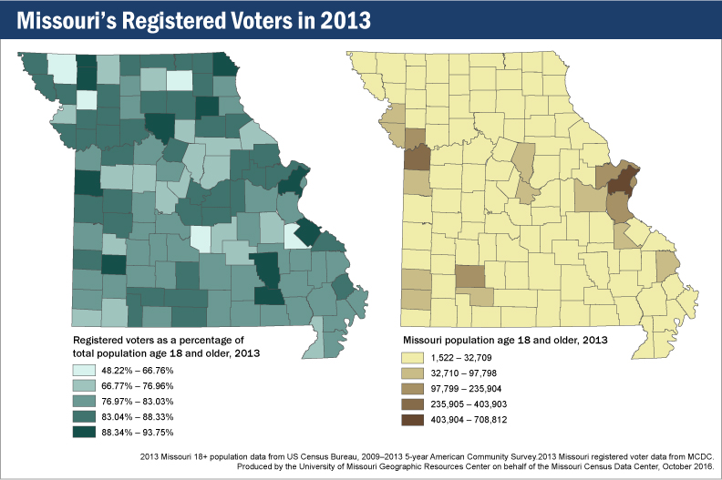
Looking at the map (left) of registered voters in 2013 as a percentage of total county population ages 18 and older, we see some interesting patterns. The areas around Kansas City and St. Louis represent two large blocks of registered voters, but that shouldn’t surprise anyone, because those places represent the two largest concentrations of people in the state. (The map on the right shows where Missourians aged 18 and older live.)
What about the rest of the state, though? Dade County stands out with a fairly high percentage of registered voters, but neither Boone nor Cole counties are in the top tier of voter registration. Then there are counties with lower total populations but higher registration rates: Carter, Chariton, Clark, Gentry, Reynolds, Shelby, Ste. Genevieve, and Worth are all in the highest tier of voter registration, despite not being highly populated.
What’s the point? In addition to the usual message of “every vote counts,” these two maps show that large populations do not necessarily translate to large voter populations. This will make for some interesting viewing once the returns start coming in on Election Day. Keep in mind, too, that this map of voter registration rates can be compared to a map of voter turnout to see whether these patterns remain the same. That’s a comparison for another month.
Map of the Month
What Does Half of Missouri Look Like?
According to the U.S. Census, Missouri had a population of 5,988,927 people in 2010. Where do they all live, though? What is the fewest number of counties required to represent half of the population? Or the fewest number of census blocks? Or, with 2016 being an election year, the fewest number of voter tabulation districts?
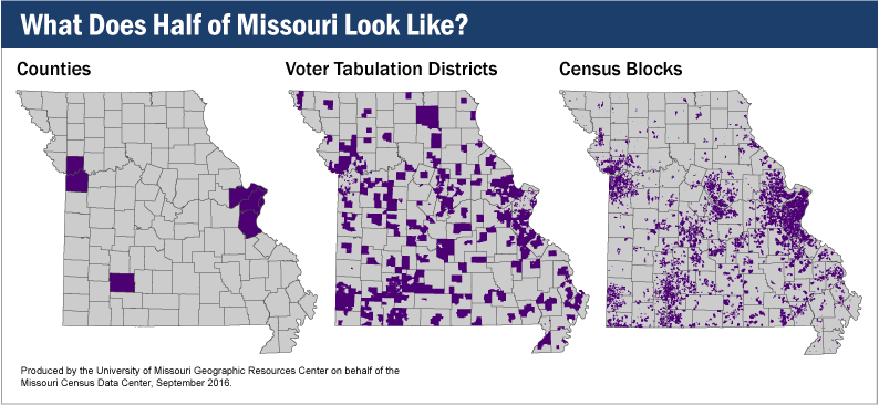
In each case, it turns out that you don’t need that many. If you were collecting counties, you would need only seven — Clay, Greene, Jackson, Jefferson, St. Charles, St. Louis, and St. Louis City. That’s just 6% of Missouri’s total of 115 counties.
Voter tabulation districts tell a similar story. To get to half of Missouri’s population, you would need only 941 of the 4,813 districts in the state, or roughly 19%.
Most starkly of all, out of Missouri’s 343,565 census blocks, you would need only 5.3%, or 18,455, to represent half the state’s population.