MCDC News and Updates

Story Map

Missouri Racial Demographics in Census 2010

race map illustration

About a year ago, the Missouri Census Data Center and MSDIS jointly published a story map detailing just a few of the many ways that Missouri benefits from a complete and accurate census. While the official counting period for Census 2020 has only just recently come to a close, we thought it would be interesting to take a look back at what Missouri looked like ten years ago, starting with racial demographics.

The maps in this application show the percentage of each Missouri census tract that identified as White, Black, Hispanic, Asian, American Indian, or Native Hawaiian. Unsurprisingly, the overwhelming majority of our census tracts are primarily occupied with Missourians who identified themselves as White. If you take a moment to compare the different categories, though, some very interesting patterns start to make themselves known.

Missouri Census Data Center frequently works with MSDIS on mapping and data projects. MSDIS is a spatial data retrieval and archival system offering many mapping resources, primarily focused on the state of Missouri.

Map of the Month

Missouri’s Uninsured Population, Before and After ACA

In March 2015, the U.S. Census released the 2013 data collected by the Small Area Health Insurance Estimates Program (SAHIE). The SAHIE data is a valuable reference that provides annual estimates of health insurance coverage for every county in the United States. That year, MCDC published a map showing insurance coverage rates for Missouri counties. The 2013 SAHIE data was of particular interest, as that was the last round collected before the first enrollment period of the Affordable Care Act (ACA, or “Obamacare”).

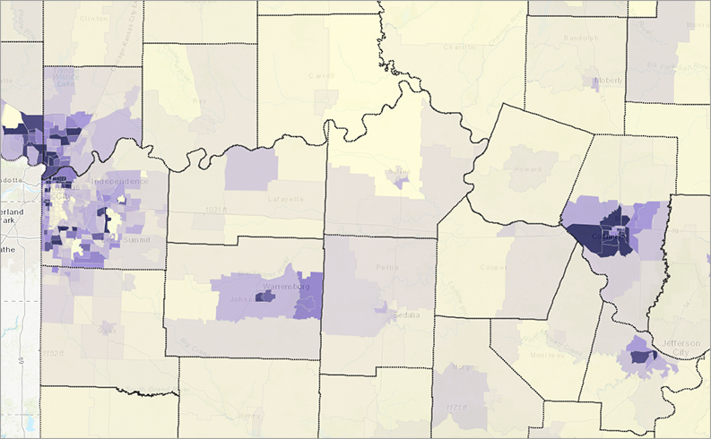
More than five years have passed since the Affordable Care Act was enacted, and we now have an opportunity to compare rates of uninsured persons across Missouri between 2013 and 2018. These two maps both use SAHIE data and the same value scale. (Note that the 2013 map shown here differs slightly from the one we published in 2015. This is due to a different classification scheme, but the underlying data is the same.)

Uninsured in Missouri, before and after ACA

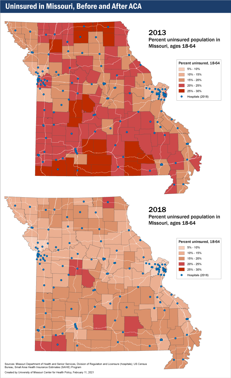
Taking a look first at the 2013 map, we can see that the percentage of uninsured working adults aged 18-64 in Missouri ranged from a low of 11.6% in St. Charles County to a high of 29,3% in Knox County. All counties in the state had an uninsured working population of 11.6% or greater.

The picture is quite different in 2018. Almost all Missouri counties now have uninsured rates of less than 20%, with many under 15%, especially in the central areas of the state. A few counties in the Kansas City and St. Louis areas have uninsured rates of less than 10%.

More significantly, the number and rates of Missouri’s most-uninsured counties have gone down substantially. In 2013, there were 20 Missouri counties where more than a quarter of the adult population were uninsured. By 2018, there were none.

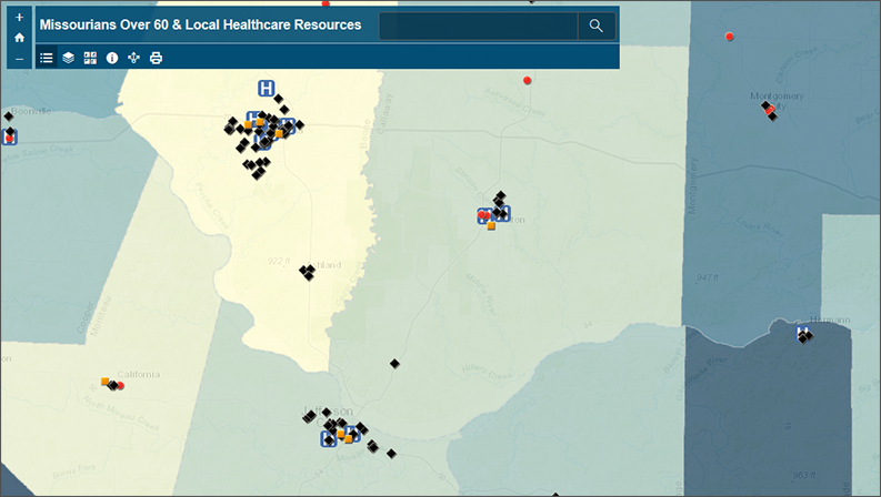
Despite the differences in uninsured rates over the five-year period, one thing hasn’t changed much: The number of hospitals. In fact, between 2013 and 2018, the number of Missouri counties that lack a hospital increased from 41 to 46, according to the Missouri Hospital Profiles By County list, maintained by the Missouri Department of Health and Senior Services (DHSS).

However, only eight of those counties — Hickory, Knox, McDonald, Morgan, Ozark, Shannon, and Wright — had uninsured populations of 20% or more in 2018. That compares with 15 counties without hospitals that had uninsured populations of 25% or more in 2013. So, the overall picture for access to affordable health care has improved.

In addition, the DHSS list of hospitals does not include smaller facilities such as rural clinics, which can better serve a rural population with higher insured rates.

Story Map

Change in Missouri Voter Turnout, 2000-2016

aerial view of downtown St. Louis

With this month’s MCDC/GRC story map, we explore the changes in voter turnout across the state between presidential elections to shed insight on how Missouri has gone from purple to bright red in just a few short years.

The map, designed by Jefferson Daubitz of the Missouri Spatial Data Information Service (MSDIS), examines the question of who votes, rather than who they vote for. It explores a variable too often ignored in politics — changes in turnout. Each map is fully interactive. Right-click on any county to open a small window that shows the change in voter turnout between each presidential election since 2000.

Missouri Census Data Center frequently works with MSDIS on mapping and data projects. MSDIS is a spatial data retrieval and archival system offering many mapping resources, primarily focused on the state of Missouri.

Missouri County Pages Are Back

After a very long hiatus, the application formerly known as “Missouri County Pages” is back in operation. We’re now calling it “Missouri [County] Fact Sheets”, and a few of the old data variables have been replaced. Otherwise, the application has similar appearance and functionality to the old version.

The Missouri Fact Sheets application generates a report for any county in Missouri, including population trends, age and race, income, employment, agriculture, households and housing, poverty, education, and children and families.

See it in action here: http://mcdc.missouri.edu/applications/MO-county-factsheets/.

Story Map

Women’s Role in the Missouri Workforce

Illustration by Ankita Ackroyd-Isales

Although Women’s History Month has come and gone, it is important to continue thinking about the various trends facing women at work. Here, we examine workforce participation. Women’s participation greatly increased throughout the second half of the twentieth century, but beginning in 2000, it began to stagnate and decrease.

This story map, designed by Abby Hunt of the Missouri Spatial Data Information Service (MSDIS), offers a county-level look at female participation in Missouri’s economy.

The Missouri Census Data Center frequently works with MSDIS on mapping and data projects. MSDIS is a spatial data retrieval and archival system offering many mapping resources, primarily focused on the state of Missouri.

Map of the Month

Food Insecurity for Missouri’s Children

One of the most significant changes to daily life that we’ve seen from Missouri’s response to the Coronavirus is the closure of many public school systems. While no state-level order has been put into action, cities and counties from across Missouri have closed their doors and moved to online education. This, in turn, has brought the topic of childhood food insecurity to the forefront of many discussions across Missouri.

This web map, designed by the Missouri Spatial Data Information Service (MSDIS), illustrates the percentage of children, by county, who are faced with such a challenge. With schools now closed for an unknown amount of time, it is more important than ever to keep the reality of childhood hunger in mind.

Missouri childhood food insecurity

The Missouri Census Data Center frequently works with MSDIS on mapping and data projects. MSDIS is a spatial data retrieval and archival system offering many mapping resources, primarily focused on the state of Missouri.

Map of the Month

Missourians Over 60 and Local Healthcare Resources

As the Coronavirus becomes a global threat, older Missourians are increasingly at risk of contracting this potent disease. This web map, designed by the Missouri Spatial Data Information Service (MSDIS), features county-level demographic data from the Missouri Census Data Center that highlights Missouri’s over-60 population, as well as several datasets from the Missouri Department of Health and Senior Services that highlight some of the healthcare resources that are available to them.

Missourians over 60
The Missouri Census Data Center frequently works with MSDIS on mapping and data projects. MSDIS is a spatial data retrieval and archival system offering many mapping resources, primarily focused on the state of Missouri.

Story Map

Missouri and the 2020 Census

2020 will be more than just another new year in the United States. In addition to marking the beginning of a new decade and heralding another presidential election, 2020 will bring with it another decennial census.

What is the census, though? And why is it so important?

Our colleagues at the Missouri Spatial Data Information Service built a story map exploring the 2020 Census and its consequences for Missouri.

The 2020 Census in Missouri

The Missouri Census Data Center frequently works with MSDIS on mapping and data projects. MSDIS is a spatial data retrieval and archival system offering many mapping resources, primarily focused on the state of Missouri.

Story Map

Missouri Voter Turnout in General Elections Since 2000

How many people in Missouri actually exercise their right to vote?

As Missourians get ready to head back to the polls for the 2018 midterm election, our colleagues at the Missouri Spatial Data Information Service built a story map showing voter turnout for previous Missouri general elections from 2000 through 2016.

The Missouri Census Data Center frequently works with MSDIS on mapping and data projects. MSDIS is a spatial data retrieval and archival system offering many mapping resources, primarily focused on the state of Missouri.

Map of the Month

Missouri Educational Attainment and Income

Educational attainment is an established, validated predictor of income. This map-of-the-month series looks at the distribution of both characteristics in Missouri’s counties. Derived from the U.S. Census Bureau, American Community Survey (ACS) 2012-2016 5-year data, Missouri households are mapped here by level of educational attainment and median household income, while a bivariate choropleth map displays the variable impact of earning less than a high school diploma on household income.

Education vs. Income in Missouri, 2012-2016

The bar chart, based on the 2016 ACS 1-year release, establishes the relative distribution of median household income by level of education. While the overall median household in Missouri realizes approximately $36,000 in income, the median household in Missouri headed by someone without a high school diploma or GED is closer to $20,000.  Completing high school results in a bump of roughly  $10,000, with the median household income of high school graduates a little more than $30,000. Completing some college or an associate’s (2-year degree) results in an incremental increase in household median income to the mid-$30,000 range, but it is completion of a bachelor’s degree or greater that accelerates median household income into the mid-$40,000 to mid-$50,000 range annually.

Educational attainment, however, is not the only driver of income. Access to workforce opportunities and proximity to infrastructure impacts potential income too. Review of the Median household income map reveals the influence of infrastructure investment and population density in driving up wages and income, as seen in the counties shaded in the darkest green.  It’s also interesting to visually note the geographically layered gradation of quantiles of the state with the I-70 highway corridor connecting Missouri’s relatively high income metropolitan areas, and the agricultural northern tier of counties falling into the mid-quantiles, while lower income households concentrate in the southern tier of counties (with exception of income concentrating in the Springfield metro area).

Not surprisingly, a close look at the concentrations of level of educational attainment (the blue-scale maps), correlate at the county level to the median household income map fairly predictably: Populations with higher concentrations of higher levels of education also have higher median household incomes.

The bivariate choropleth map, Median household income by percent of adults with less than high school diploma or GED, lets us see the outliers as well as validating the correlations we anticipated. For example, the truer the shade of blue a county is coded, the higher the percent of the adult population without a high school diploma/GED and the higher median household income indicating some combination of higher wage job and income opportunities relative to educational qualifications. We see these on the periphery of the other end of the spectrum, counties with higher median household incomes and the lowest rates of households with low educational attainment, suggesting “bedroom” communities. Further study to confirm this pattern might include looking at patterns of in-migration over time and commuting patterns.